Final Pieces: King Popiel and the Mice Tower

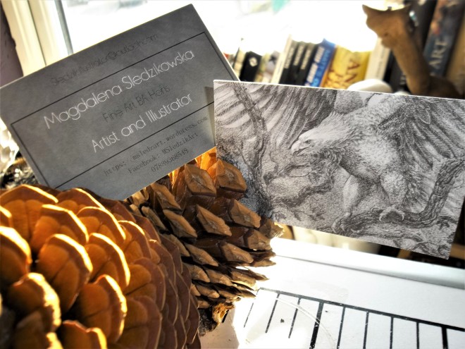
It took me a while to recover from all the all nighters that I had to pull out in order to complete these beauties! I am really proud of myself although I wish I didn’t leave everything to the last minute.. I don’t think I will ever learn.

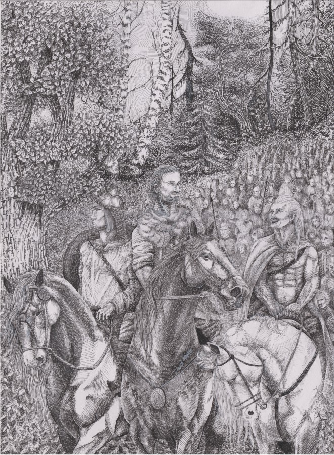
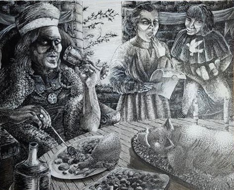
I have completed 5 illustrations for the exhibition, which I will speak of later in my posts so keep updated! Four of the illustrations are for the legend King Popiel and The Mice Tower, and one is Wars and Sawa that I decided to revisit from my first semester. I wasn’t sure how to proceed with posting them so I will just go through one legend at a time and then go into the detail on how the exhibition went an the process of setting it up. I will also go through designing the book

but for now…

The legend about King Popiel is very known in Poland and it goes;

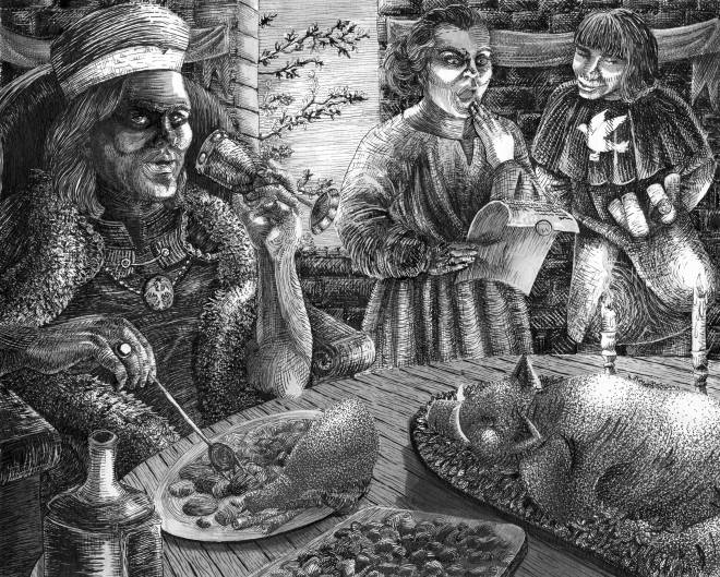
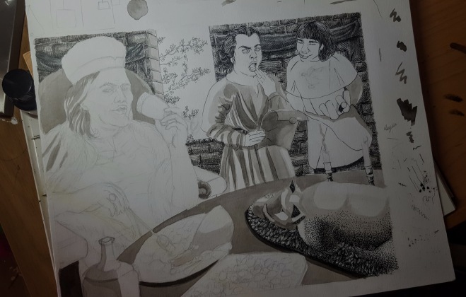
Popiel was a great ruler, his castle was built near a town Kruszowica. Although he couldn’t take care of his kingdom well and wisely, and treated his civilians badly. Popiel was cruel and spent most of his time on feasts and amusements. He wouldn’t think about his people at all and did not consider their opinion. His wife had a similar attitude towards the poverty. Only the relatives of the king were worried about the fate of the residents of the kingdom, they couldn’t let all the fortune to go to waste. They decided to influence his consciousness and shortly announced a visit.

magdafinal5

Meanwhile Popiel’s wife plotted a sinister, cunning plan. To once and for all get rid of the arriving guests she poisoned the wine with a mixture changing anybody that has contact with it into mice.magdafinal4

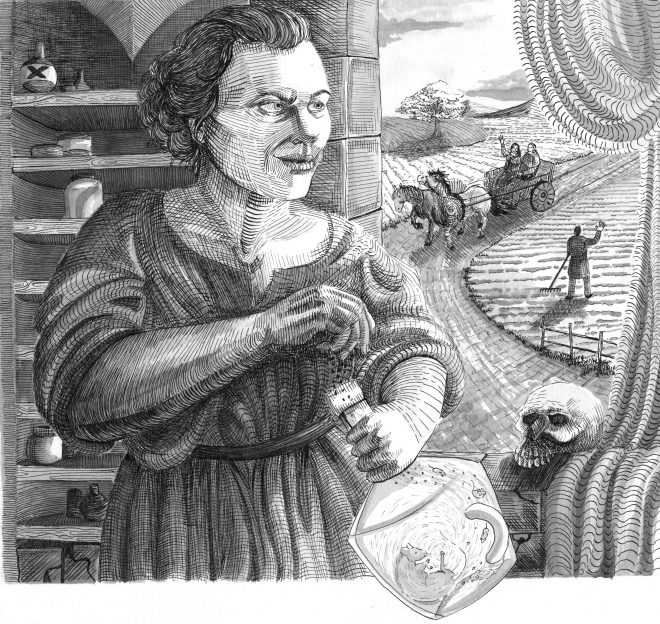
The plan succeeded and soon everybody were bewildered by the poisoned liquor. When king Popiel was just about to rise another toast, the participants of the gathering started changing into mice, one by one.MAGDA FINAL2

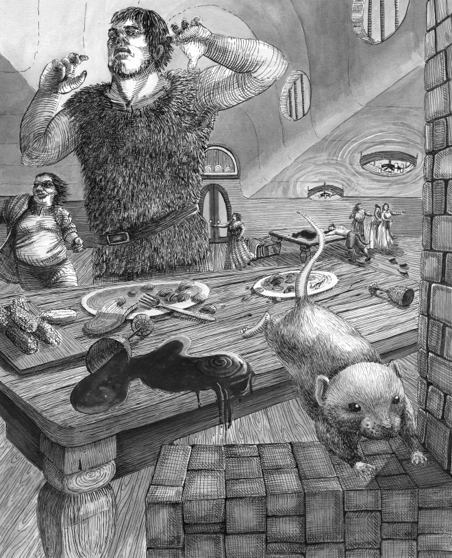
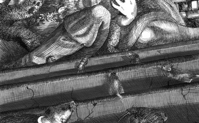
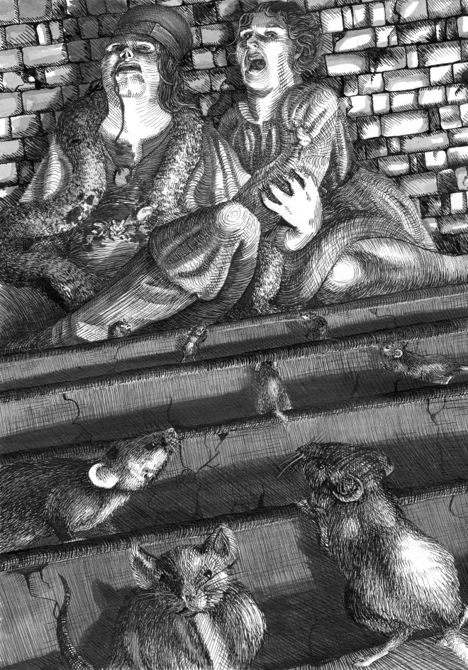
Unaware of the enormity of what was about to happen the King and queen ran to hide at the top of their castle. The mice reached them with no trouble and soon the couple was bitten to death.

MAGDA FINAL

This is how I translated the legend basing it on my memory and some resources I found and I am really happy with how it turned out. The book contains the exact same text.

Experiments for the book design

As I have to design the book I had to produce some visual enchantments for it. I decided that ink splatters will be the most suited for the black and white design I’m going for. I want to link a little of contemporary with Gothic/vintage theme. Some of these will be used as back grounds of the pages and a front cover, and some will be cropped and pasted as if they are merging from the corners of the illustrations . Hopefully the program that I use (inDesign) will allow me to do this effectively after a couple of tutorials. I suck at Photoshop and this is worryingly similar to it… I am concerned if it will look interesting rather than like a huge mess .

I have also practised some ornaments for decorating the pages with the text. I want to put them at the bottom of paragraphs or stories and some at the corners or along the pages. Scan_20170506.jpg

1st Final finally finished

Yes. This bad boy is finally complete and it was a nightmare that definitely taught me some lessons for the future. It is the first time I have worked with a dip pen in such scale and it was messy. Frustrating.  And it payed off.

I have previously exercised mark making with copying Albrecht Durers and Bernie Wrightsons work in my sketchbook. It allowed me to feel confident with the techniques and developed my mark making. I know for sure the illustration could be cleaner, as the texture of a scratched and painted over paper looks rough in different light. This is why for the exhibition I will be scanning the finals in and printing them in high resolution to eliminate the texture of paper.


Business Cards

As I keep ranting, the Final Exhibition is coming fast. All the deadlines are piling up and I am feeling very excited but also very anxious!

On the other hand, my personal Business Cards have arrived and I couldn’t feel prouder! Hopefully giving these out will guarantee some interest for future commissions. I really hope that my work will encourage audience to contact me.

104_6567.JPG

Process of working on the finals

The Final exhibition is coming towards me with real big footsteps now. I have been photographing the process of inking the first final piece for the legend called King Popiel and the Mice Tower. The legend is set in very old times as the previous legends I attempted illustrating.

It is about a King and Queen living in a town called Kruszwica in Poland. They were both really bad rulers and not very liked by their people. All they did is feast, drink and spend money on big parties. One time they got a letter from a family that lived near by, announcing they are coming for a meal. This message really enraged the couple as the visitors were cherished by the people. The queen has plotted a plan of changing everybody into mice during the meal by serving spiked wine.

During the meal, as supposed all guests changed to mice. The King and Queen ran to hide away at the top of the tower. They got attacked by all the mice and died. Since then the tower has its name The Mice Tower.

This slideshow requires JavaScript.

The process of completing this piece was somehow still experimental, because I haven’t worked like this before. First, to make it easier for myself and also estimate the lights and shadows, I applied ink washes. I found later that doing so adds more depth together with the darkness of the ink. Compared to my previous way of working with fine-liners the difference in tone is drastic.

Next I started to add mark making here and there. I covered the brick wall first a that was the largest and darkest area. I decided to do dot work on the hog roast and meat as I believe the texture matched the form. Then I proceeded to the fabrics, the texture and folds have come easier for me this time. Then I proceeded to the wood on the table and darkened the brick wall as it seemed too light. I’ve done the Kings clothes before I moved on to sketching the planes of the faces. I have left the faces last as I find them most challenging so to make sure they are as accurate as possible I take my time working the tone around first.

The mark making has developed as I don’t use cross hatching as often as before and instead I follow the flow of the form and thicken the line where necessary. This creates much more variety and seems more genuine.

Business Cards Ordered!

YES! A very proud moment for me as a growing artist! Building up to the Final Exhibition there’s a lot of things that need to be done. One of them was getting our own Business Cards, other are more major and stressful ; writing my dissertation in third person (HOW ON EARTH AM I GOING TO ACCOMPLISH THAT?!?! help much welcome!) and printing our catalogues.. Together with finalising the Illustrations and magically change them into a book on time.. Hold me

Developing Illustrations for my Final Exhibition…maybe

When I develop my drawings I need to make sure I practice plenty before doing a large design. This is all done in my sketchbook, together with notes and small crappy sketches or photographs of me and my boyfriend for body reference!                                                      When I feel comfortable to move the composition onto a bigger page that’s when the official final is perfected. Here is a bad image of my work space and 2 out of 3 compositions I have done so far. This is how they look before I start inking. These two are too small for my preference, so I’ve scanned them so I can easily trace them larger and basically draw the images again. Oh the joys… 🙂

20170402_180501 (1)

This semester I have changed my approach to adding tone a little from the last semesters work. Practising with dip pen and ink washes made me realise how much faster it is and how easy it is to build tone in this way. The way I worked before required a lot of time, all of the tone was build with hatching technique! So working with washes first and then adding stippling is much faster and in my opinion more effective!20170331_171522

Another bad photo of my development! What is important is that hopefully you can tell how much different ink and fine liners are. With fine liners I can comfortably do dot work and detail but they are not as dark as ink and fade easily.. which is good for error I suppose as I can rub the marks off with ‘ink rubber’.  20170402_180444

More Final pieces from last semester

I realised the rest of my final illustrations from last semester haven’t been posted on here. So here they are! This is not the last time you will be seeing them as they will be a part of my book I have to produce for my exhibition show! I also want to re-do Bazyliszek.. considering i only did that one over night I think giving it a bit more time and making it larger would make a brilliant final piece for the exhibition!

Legends illustrated here are Bazyliszek, a legend about a dragon that hatched from a chcken’s egg, hiding in the dungeons of Kraków it guarded a treasure changing anybody who tried to steal it to stone!

The men and an eagle is a continuance of  Lech, Czech and Rus legend I wrote about in my earlier post. In these illustrations they find the tree with the white eagle. Rus reaches out for his bow to kill the eagle but Lech sees it as a sign to stay and establish his land, the village (Lechia) and people (Lechiatanie) was named after him. Today it’s Polska and Polacy.

3.., 2.., 1.., GO! Second semester of my last year as an Undergraduate

I admit! I have been rarely posting on here as I am buried in work. Second semester is packed with so much responsibilities for me it is hard to get my head round it. I am currently doing an Art History module where I am curating 3 objects for an exhibition! Very exciting stuff. Me and my other peers have to respond to a theme ‘Alternative Facts’ and write labels, panels etc for pieces from the School of Art Collection. The exhibition opens in May and everything has to be done by then!

I am also still powering on with my SUPER ambitious illustration! This semester we have to produce a book AND set up our own exhibition with the works we developed over the semester. So much stress and work, so little time!

Because of that I often loose interest in my project, and drift off to my random ideas to draw something completely irrelevant. Sometimes it’s something that will give me some more control over a medium I haven’t used before or a medium I haven’t used in a while. Doing so gives me a fresh look and inspiration towards my project… surprisingly! It all goes back to Uni work in the end!

It is important to me because sometimes we need to remind ourselves that we are good artists, that we have our own creativity and we know how to bounce off a certain project.

With these illustrations I was hoping to find out if I am any good with crayons and colour! Brought myself a very nice colour pencils set and I think I’m rocking it. I often consider using colour in my final illustrations, but I don’t think colour pencils would be a good choice with ink.

I was also practising my ability to control ink! It was really fun to do but so, so fiddly. And messy.. The drawing is of a photograph of a bronze sculpture I took in Cardiff. It was easy to identify the tone on it and how the face reflects light. I needed this exercise to broaden and improve the way I draw and shade faces and it allowed me to feel comfortable with ink.

Half way through my last year at Aberystwyth University

First semester almost swiped out the way, only the assessment left on the checklist. With second semester lurking round the corner I thought about sharing another final piece for the Polish Folk Legends Illustration project I have been working on so far. I will carry on developing this project until my final exhibition… and probably carry on after that too.

This piece is an A3 fine-liner stippling where I carried on with my tutors advice and worked with tone rather than lines. It presents 3 brothers from a Slavic tribe, Lech (right) Czech (middle) and Rus (left). They are walking through a thick forest with their people in order to find new land. I wanted to show individual personalities of three men as they are often described in the legends. Lech was kindhearted and joyful, Czech was bright and clever and Rus was described as quiet.

With this illustration I wanted to bring out the importance of the men, by going lighter the closer I come to the figures I made them stand out from the composition. Although i feel like the tone should be darker in certain areas and I should practise more on that in the future. I believe sooner or later i would like to try colour in some areas of the illustration.Scan_20170111 (5).jpg